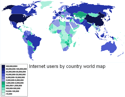
This first map is from 2007 figures from Internetworldstats.com. It shows the amount of people in every country that are using the internet. The US and China are the 2 countries with the most, over 100,000,000, people using the internet. Generally, nations considered "first world" countries have a lot of internet users even if their populations are not that big. Germany has more internet users than either Brazil and Indonesia even though it has about half the population. Another glaring fact is that most African countries have a very small amount of internet users and none have more than 10,000,000. Africa has yet to see widespread internet usage and most of the continent is light green, indicating less than 10,000 people per country.

This image, from mapsoramma.com with data from Encyclopedia Britannica 2003, shows the world religions, with each area representing where that religion is the majority. Some interesting points include that almost all of South America has a Roman Catholic majority, as it was colonized by Spain and Portugal, both Roman Catholic countries. Central Africa has large swaths of purple indicating the indigenous religions in that area are still practiced. All of India has Hindu majority and all of Pakistan is a Sunni Muslim majority. All the countries in Northern Africa and the Middle East have a majority of Sunni Muslims except Iran, which has a majority of Shiite Muslims. In general, the each religion is predominant in one or 2 regions and often the region(s) is the same place where the religion was founded or colonized by. This relation holds true not only for the link between Roman Catholics in South America and Spain, but Protestants in the U.S, Australia and Britain.
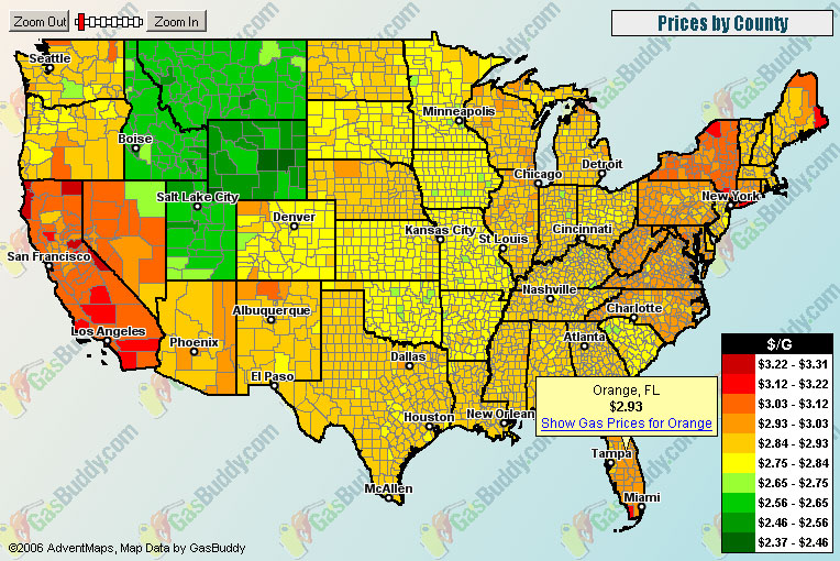
This last map shows the average price of gas per county in the US in 2006 from gasbuddy.com/. California, Nevada and New York have higher prices in general. Also, there is a definite difference between states, even counties bordering each other, indicating the tax on gas is higher of lower in those states. Idaho, Utah, Montana, and Wyoming all have prices in the green, so less demand or taxes have kept their gas prices lower than the rest of the country. The Midwest is mostly yellow prices and the more east you go, to the more populated states on the east coast, the prices get higher.
Great maps and descriptions.
ReplyDeleteNeat layout.
Only if you could provide the complete linkage (reference) of each map.
Grade: 9.5